Tabular Navigation
Tabular navigation
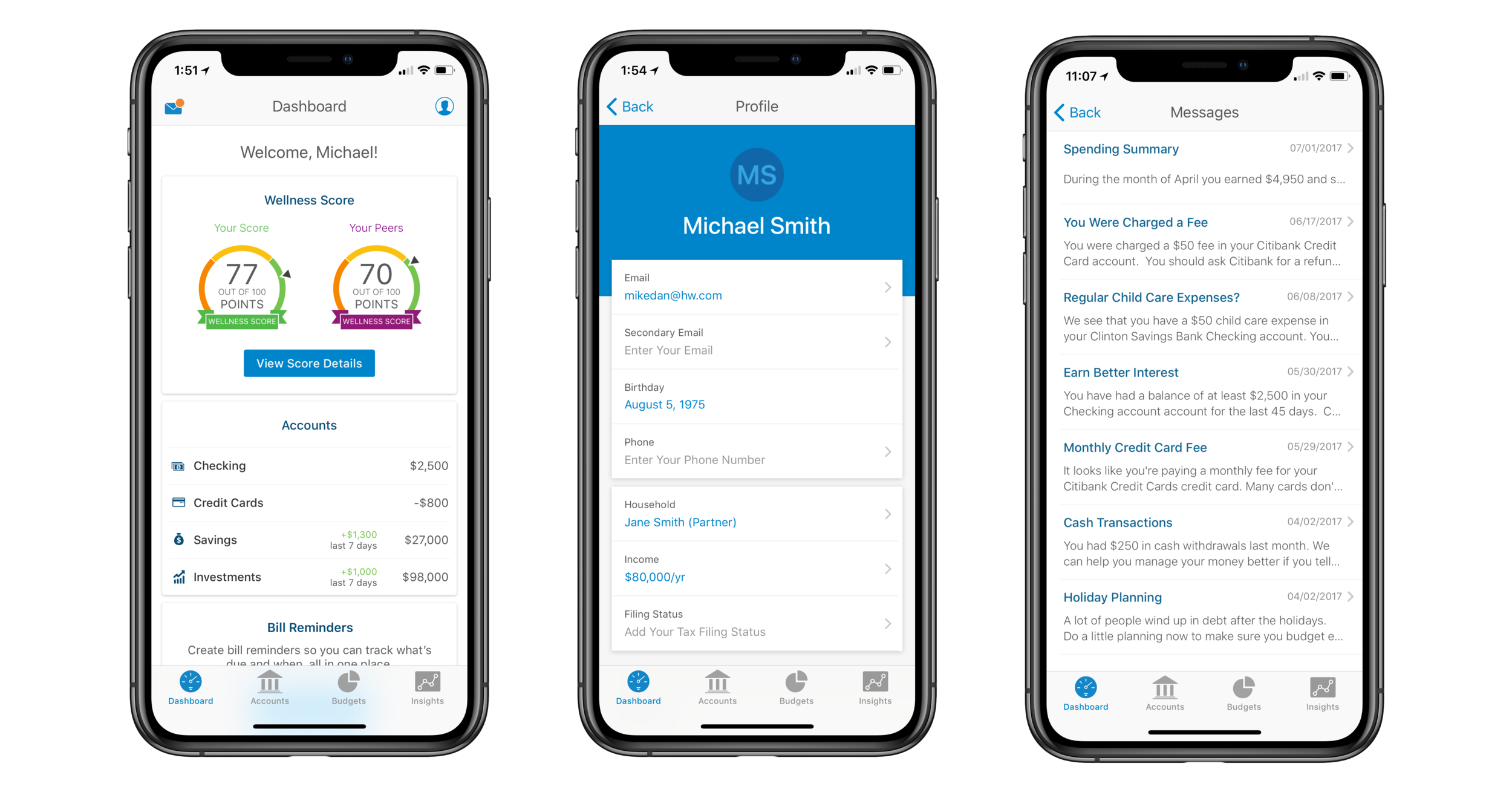
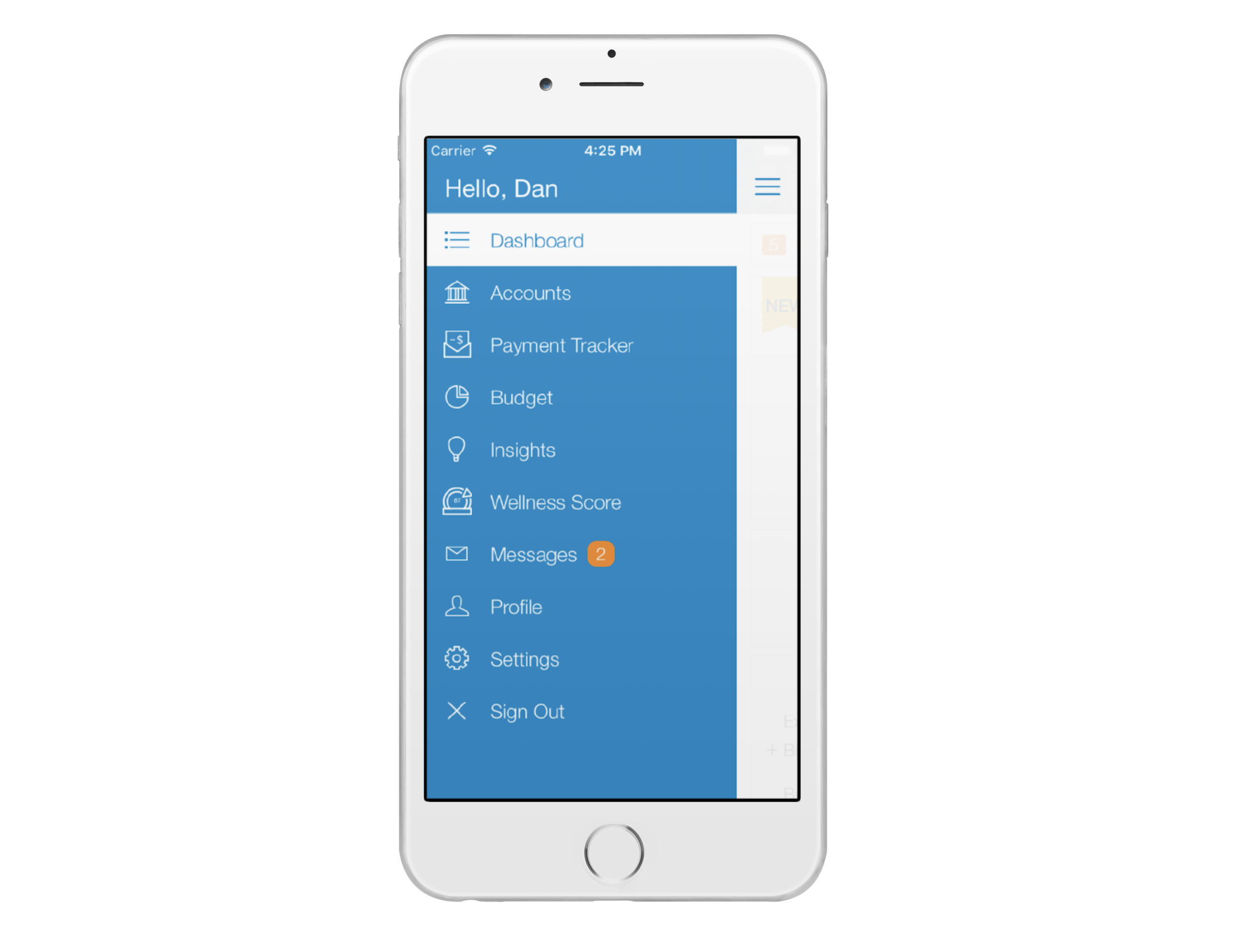
Our mobile applications previously followed a hierarchical navigational structure - users navigated by making one choice per screen until they reached their desired destination, which made some features difficult to find. The objective of this project was to remove the hamburger menu and replace it with a tab bar in an effort to flatten the content hierarchy and easily surface key features to our users.
HelloWallet iOS Mobile App
BACKGROUND
The mobile squad was working on designing a new budgeting feature for our mobile applications called Flexible Budgets. As we continued to build upon this feature, we kept running into issues on how to incorporate it into the existing application structure. The team was limited in what they could design and had to create unideal work-arounds for users due to the system’s limitations. This led me to pitch an Innovation Sprint project dedicated towards exploring whether there was a better alternative to our navigational structure.
Brainstorming
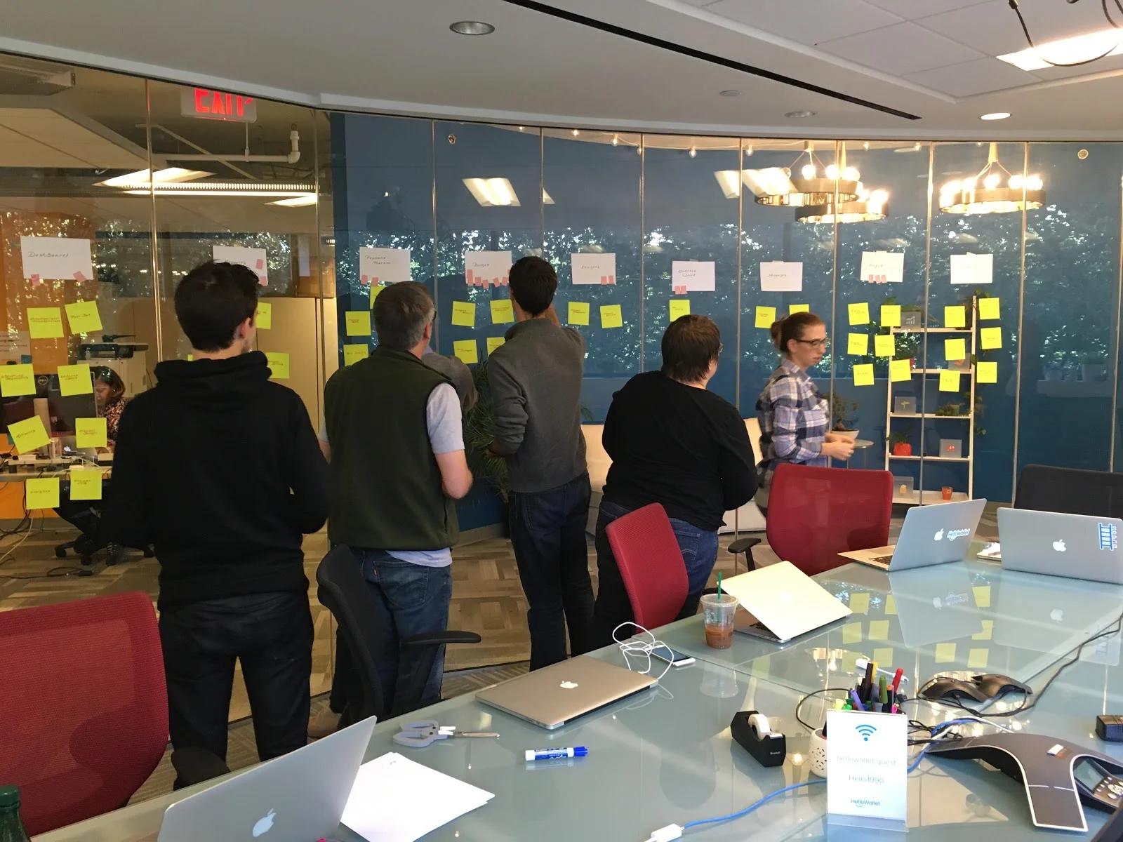
To kick-off the project, I led a brainstorming session with the team where we mapped out our current mobile IA and voted on features we thought should be primary categories. We also discussed technical feasibility and potentially changing our mobile app to a flat navigational structure where all primary categories are accessible from the main screen.
Card Sorting and Tree Testing
We then conducted an open card sort where we asked users to organize features in our mobile apps into groups. Seeing how users organized our content helped us understand what information was most important to them. It also signaled to us how we should label our navigation menu. We used the results from the card sort to create a preliminary navigational structure that was broken into four categories and ran a tree test to validate it.
Prototyping
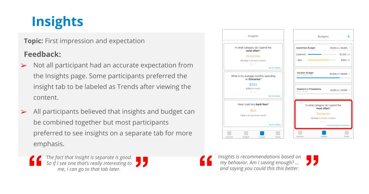
I used the results from the tree test to design three different prototypes with each one representing a different set of menu options in the navigation bar. Then we ran a study where participants were asked to complete a series of tasks using one of the three prototypes. Afterwards, they were presented with the other two prototypes and asked a series of interview questions where they compared all three options against each other.
Design PRINCIPLES
The prototype testing helped us arrive on a path forward, which was to split up our application into four main buckets: Dashboard, Accounts, Budgets, and Insights. During this time, I created a set of design principles for the mobile apps in order to help guide the team throughout the design process:
Refined content hierarchy
Better organization of content
Surface “hidden” features
Reduce cognitive overload by streamlining content displayed on each page
Increased user efficiency and engagement
Increase interaction speed
Reduce the number of steps a user has to take in order to find features
Execution
We tackled the remainder of this project in two-week sprints, working collaboratively with a Product Manager, UI Designer, QC Engineer, and Android and iOS Developers. As UX Lead for our mobile applications, I was responsible for creating all detailed Information Architecture diagrams, wireframes, and user flows. I was also responsible for running all usability testing. We released tabular navigation on iOS in January 2017 and shortly after on Android. In the end, we found that the redesign of our mobile apps increased the average number of sessions per user from 3.5 to 5.5 over the span of 3 months.
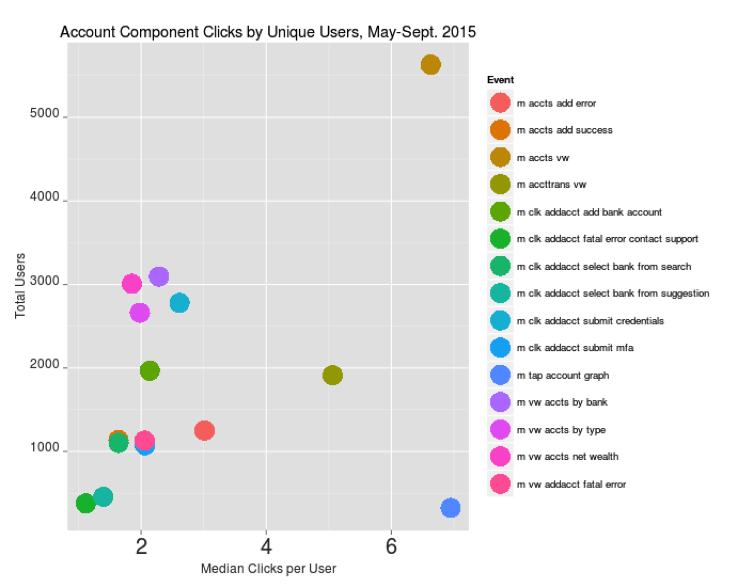
Information Architecture diagram of the iOS Accounts page. Detailed Information Architecture diagrams were created for each page of our iOS and Android apps.
